Have you ever walked into a yarn shop and felt unsure of all the colours there is to use? It can be a difficult task to narrow down what specific colours you want to use for your next project. Here is a blog that goes in depth about colour & how it can be combined to create that flattering creation you’ve been wanting to make.
Choosing Yarn Colours
When starting a new knitting or crochet project, choosing a colour is crucial. The colour wheel is a helpful tool for learning about colour theory. Each part shows the colour’s hue, shade, tone, and tint. A hue is a pure, bright colour; a shade is a colour that has been blended with black; a tone is a colour that has been mixed with grey; and a tint is a colour that has been mixed with white (pastels). Colours have a significant impact on the appearance of a project. To maximise the contrast in the design, employ a mix of dark, mid-tone, and pale shades when choosing colours for fair isle.
Making use of the color wheel
The colour wheel is used by artists to see how colours interact. Blue, red and yellow are primary colours; green, orange and purple are secondary colours; and the colours between these are tertiary colours. colours that are directly opposite, such as purple and yellow, compliment each other and provide a bold contrast in a design.
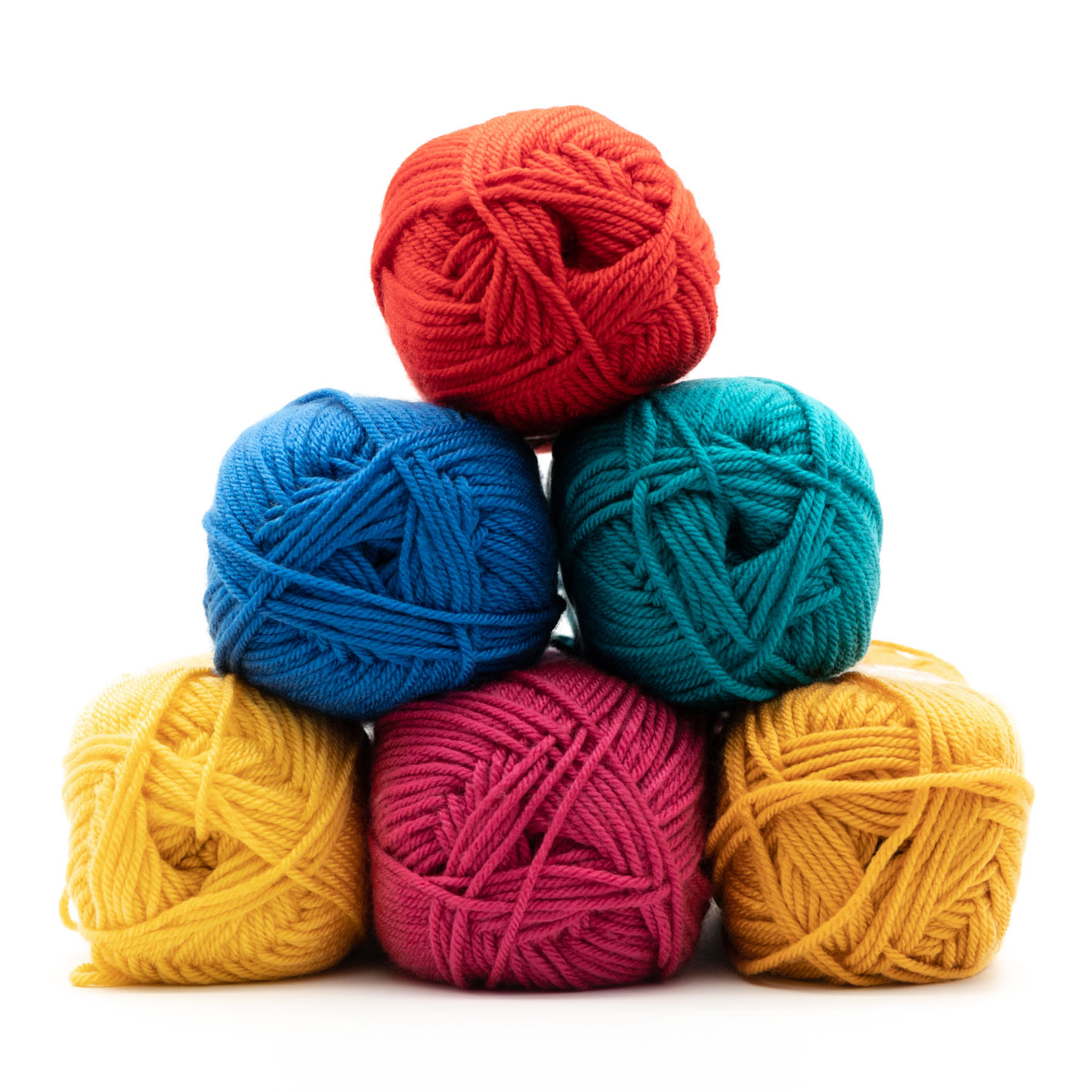
Warm Shades
Red and yellow represent the warm end of the colour spectrum, which also includes browns, oranges, and purple. Use these hues to add depth and richness to your design. Depending on your colouring, a blend of warm shades can be a very flattening mixture to use: hold yarn against your face to see what suits you.
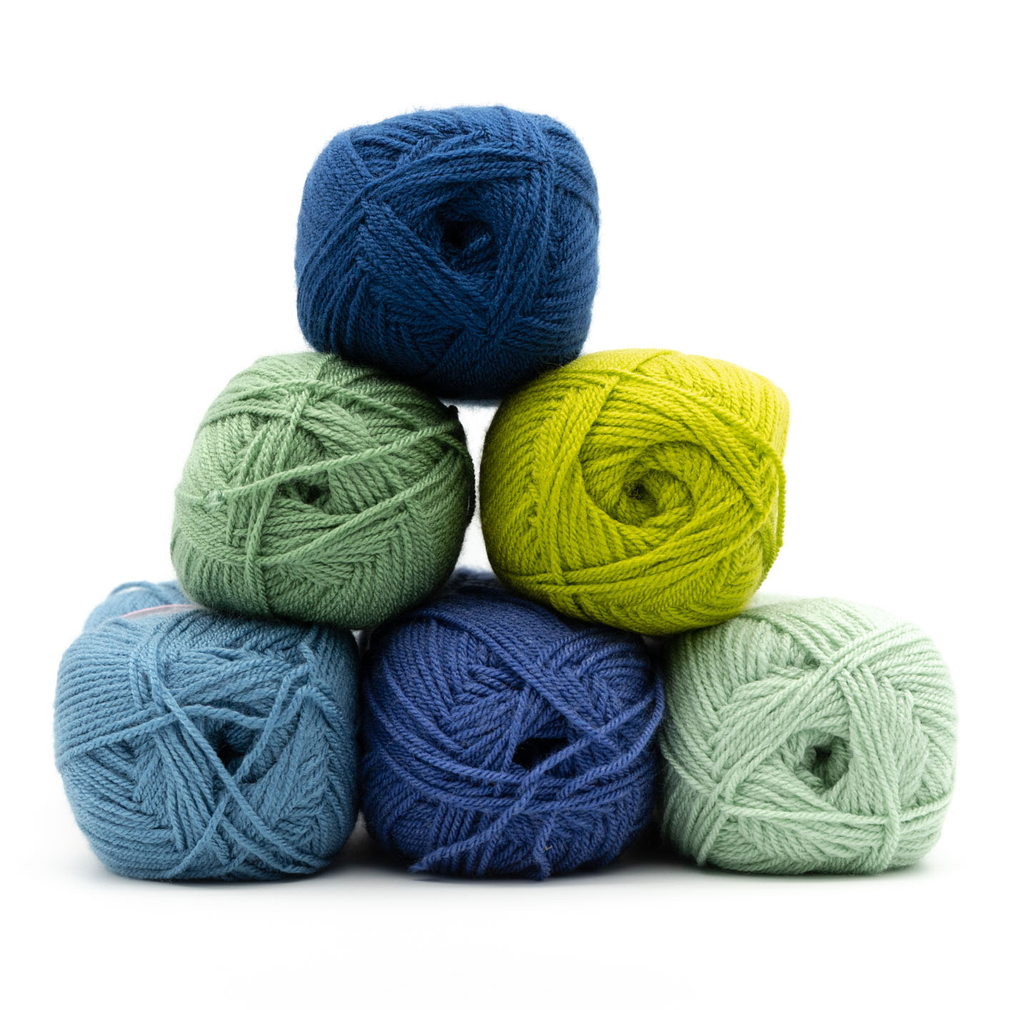
Cool Shades
At the cold end of the spectrum, blue, green, and violet can be highly effective when used together. The tones of cool colors are often darker than those of warm colors. When employed with warm shades, their influence is diminished: balancing a warm mixture in a project would necessitate a greater proportion of cool than warm colors.
Pastels
Because these very pale, frequently cold versions of deeper, darker colours are popular for baby and small kid clothes, a variety of acceptable synthetic yarns and blends are available in these colours. Pastels are especially popular in adult knitting patterns for spring/summer: hunt for ice-cream colours in lightweight yarns and enjoy working with a delicate colour palette.
Brights
Vibrant and fluorescent colors are fun to work with in a project, and they make great accessories or intarsia designs. Adding a vibrant edge or set of buttons to a color work item with subdued tones is a terrific way to spice it up. This flash of color has the potential to transform the environment.
Seasonal Mixtures
Nature may be a tremendous source of inspiration for yarn colours, especially for clothing knit in Fair Isle, intarsia, or stripes with many colors used at the same time. Sunsets, autumn leaves, iced winter berries, and brilliant spring blooms are just a few examples. Make a note of the proportions of each color in the scene in a sketchbook or a photograph. Most good yarn retailers modify their color palettes according to the seasons; for example, more pastels and brights will be available in the spring.
Black & White
Because black and white are not recognized as colors, they are not shown on the color wheel. White is a combination of all colors in the spectrum, while black is the absence of all colors. In yarn colours, the converse is true: black yarn will have been heavily dyed, whereas bright white yarn will have been completely bleached. Keep in mind that utilizing black will make your work more difficult to perceive, as well as the fact that complicated textures will not be visible to their full potential in the final garment. White, on the other hand, ensures that every stitch and detail will be visible.